
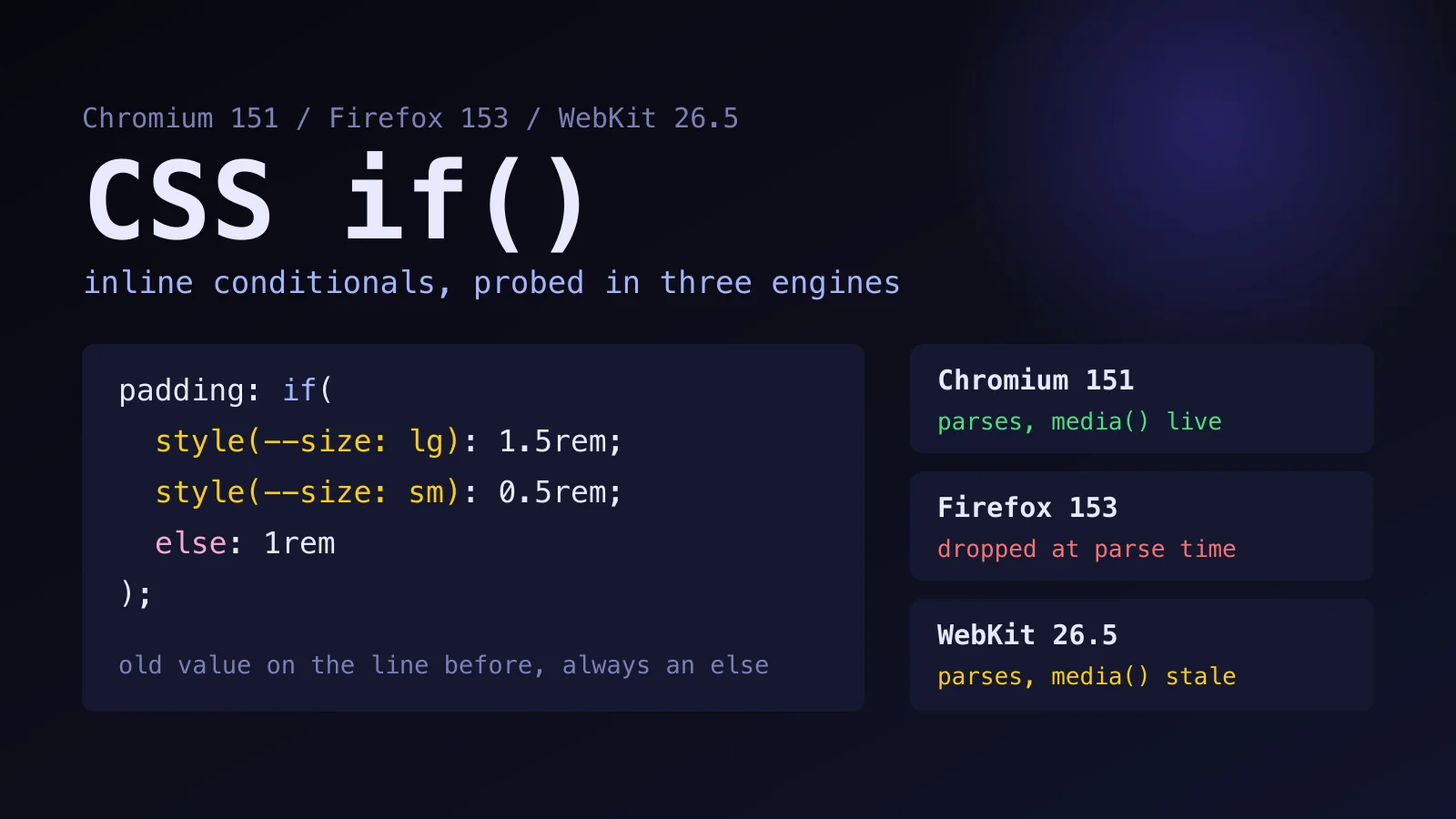
Run this yourself. The probe behind every number below:
css-if-function-support/in the Coding Dunia code-examples repo. It loads one page in Chromium, Firefox and WebKit and prints 53 checks, andindex.htmlin the same folder opens by hand.
Three conditional classes on a button is normal React. A size === 'lg' check, a size === 'sm' check, a clsx call, and a stylesheet with matching .btn--lg and .btn--sm rules. The CSS if() function folds that decision into one declaration, and those inline conditionals are why it keeps showing up in "no more JavaScript" threads.
Whether it deserves that reputation is a different matter. I ran it in three browser engines before writing a word of advice, and the result is more specific than "it's great" or "it's not ready".
What Does the CSS if() Function Actually Do?
if() returns the value attached to the first condition that is true. Each branch is a test, a colon, a value and a semicolon. The keyword else is a condition that is always true, so it goes last.
.btn {
  padding: 0.5rem 1rem;
  padding: if(
    style(--size: lg): 0.875rem 1.5rem;
    style(--size: sm): 0.25rem 0.625rem;
    else: 0.5rem 1rem
  );
}
There are three kinds of test. A style query is a comparison against a custom property on the element, as in style(--size: lg). media(width >= 600px) takes a media query. supports(color: lch(50% 0 0)) asks a feature question. Each accepts and, or and not, and MDN's page documents all three with examples. The spec lives in CSS Values and Units Level 5, and the W3C copy I opened calls itself an early exploration with major breaking changes expected. Keep that in mind before you build anything you can't rewrite in an afternoon.
One syntax detail bites people: there can't be a space between if and the parenthesis. I checked, and if ( was rejected even by Chromium and WebKit, which parse the function otherwise.
Where Does if() Replace Conditional Classes?
Conditional classes give way to if() when the component already hands CSS a custom property, and nothing else about the variant needs to change. In React that takes one line, because the style prop accepts custom properties:
import type { CSSProperties, ReactNode } from 'react';

type Size = 'sm' | 'md' | 'lg';

export function Button({ size = 'md', children }: { size?: Size; children: ReactNode }) {
  return (
    <button className="btn" style={{ '--size': size } as CSSProperties}>
      {children}
    </button>
  );
}
I should be upfront: I didn't run React for this article. The probe covers the CSS half, which is where the risk is, and the JSX side only sets a custom property. With the stylesheet above, the three buttons in the folder's index.html came out at 10px, 16px and 24px of left padding in Chromium 151 and WebKit 26.5, and at 16px for all three in Firefox 153, where the fallback line is all that survives.
So, is that better than className={clsx('btn', size === 'lg' && 'btn--lg')}? Honestly, no. A data attribute does the same job without any new syntax:
.btn[data-size='lg'] { padding: 0.875rem 1.5rem; }
.btn[data-size='sm'] { padding: 0.25rem 0.625rem; }
That works in every browser from the last decade and needs no fallback. I'd keep it as the default for plain variants and treat if() as a tool for the cases below, not as a way to retire clsx.
What Can if() Do That a Selector Can't?
Three things, and the probe verified each one: a media query inside an inline style, composition with calc() and nesting, and reading the element's own custom property, which a container style query can't do.
- A media query inside an inline style. A
styleattribute can't hold an@mediarule. It can holdwidth: if(media(width >= 600px): 300px; else: 100px), and on a fresh load I got 300px at an 800px viewport and 100px at 400px. - Composing with
calc()and nesting.calc(if(style(--cols: 3): 3; else: 1) * 10px)gave 30px. A nestedif()with astyle()outer test and amedia()inner test gave 51px wide and 52px narrow. - Reading its own element. A container style query can't match the element that sets the property, because container queries look at ancestors.
if(style(--size: lg))can, since it reads the element it sits on.
The third one has a measurement behind it. I set --tone: loud on an element and wrote @container style(--tone: loud) for that same element. Padding stayed at its base 1px. A child of an element that set the property matched and got 99px, in all three engines (caniuse lists container style queries from Firefox 151, so Firefox 153 agrees). if() sitting on the first element picked its branch at once in Chromium 151 and WebKit 26.5, with no ancestor needed.
CSS if() earns its place where a value has to follow a media query or a custom property and no selector can reach it, and everywhere else a data attribute is still the shorter and safer switch.
Which Traps Did the Probe Find?
Four traps turned up, and every one of them fails quietly instead of throwing an error. One of them cost me the most time, and it isn't in the documentation I read, so it comes first.
A missing else throws away your fallback
The standard advice is to write the old value on the line before. It works if if() is unsupported, because the browser drops the whole declaration at parse time. It doesn't work if if() is supported and no branch matches, which is exactly what happens without an else.
.noelse {
  color: rgb(0, 0, 255);
  color: if(style(--missing: yes): rgb(255, 0, 0));
}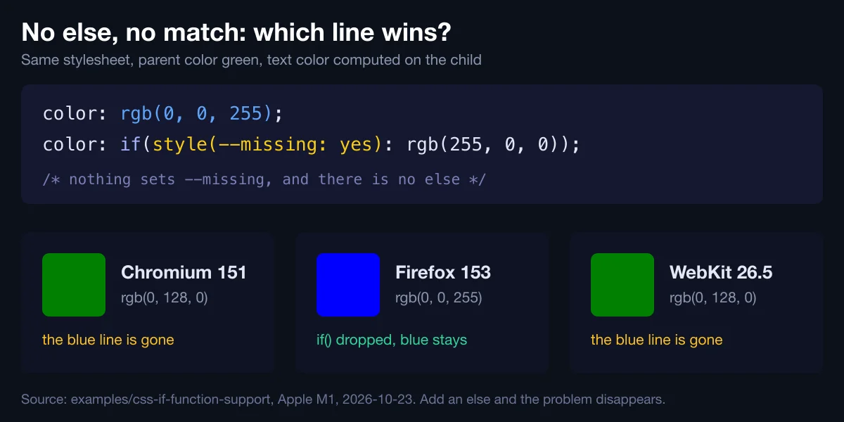
Parent color was green. Chromium 151 and WebKit 26.5 computed rgb(0, 128, 0), the inherited value. Firefox 153 computed rgb(0, 0, 255). The supporting engines treat the declaration as invalid at computed-value time. Invalid at computed-value time means the declaration parsed fine but produced nothing usable, and it then behaves like unset, so the blue line never gets a say. An else branch, even one that repeats the default, closes the hole.
style() reads custom properties only
style(color: rgb(255, 0, 0)) parses cleanly. With a red color on the element it still took the else branch in Chromium 151 and WebKit 26.5, and MDN says container style queries don't support regular properties either. Nothing warns you. If a branch depends on a normal property, copy it into a custom property first.
Typos look like working branches
A misspelled custom property name in style() doesn't raise anything. The declaration parses, no branch matches, and you get the else value. Why does that matter? Because a branch that never fires looks exactly like a branch that fired and chose the default. Read the computed value in DevTools instead of trusting the stylesheet.
WebKit 26.5 didn't follow a resize
This one is specific to the build I ran, so read it with care. I loaded the page at 400px and widened the viewport to 800px. Chromium 151 moved the media() result from 100px to 300px. The WebKit 26.5 build bundled with Playwright stayed at 100px, while an ordinary @media (min-width: 600px) rule on the same page did update. It's the WebKit build Playwright bundles, not a Safari release, and the assertion in the example fails the day that changes. Still, it's a reason to test media() branches by resizing, not just by reloading.
How Do You Ship if() Today?
As an enhancement, behind a line every browser understands, and only after you've checked where support stands. Here is the state of the three engines on October 23, 2026, according to their own release notes and Can I use:
| Engine | Status | Source |
|---|---|---|
| Chrome and Edge | Shipped in 137 (Chrome's release post is dated May 27, 2025) | Chrome for Developers, Can I use |
| Firefox | Not supported through 161; Bugzilla 1981485 is open (filed August 2025, last changed October 11, 2026) | Can I use, Bugzilla |
| Safari | Added to Technology Preview 249 on July 29, 2026; not in the Safari 27.0 release notes (September 14) or in Can I use through 27.1 | WebKit blog, Apple, Can I use |
Can I use puts overall support at about 69 percent of users, and that's the number that decides it. A third of visitors getting the fallback is fine for a padding tweak and not fine for a layout that breaks.
The probe tested two guards. Both gave the right answer in all three engines, 20px where if() works and 7px where it doesn't:
.card {
  padding-left: 7px; /* every engine */
  padding-left: if(style(--size: lg): 20px; else: 10px);
}

.gate { padding-left: 7px; }
@supports (width: if(media(width > 0px): 1px; else: 2px)) {
  .gate { padding-left: if(style(--size: lg): 20px; else: 10px); }
}
The line-before pattern is shorter. The @supports gate is better when if() changes several declarations together and you want them all or none. In practice I'd go in this order:
- Write the old value first, on the line before.
- Give every
if()anelsethat repeats the default. - Put multi-declaration changes behind the
@supportsgate. - Resize the window to check
media()branches, don't just reload.
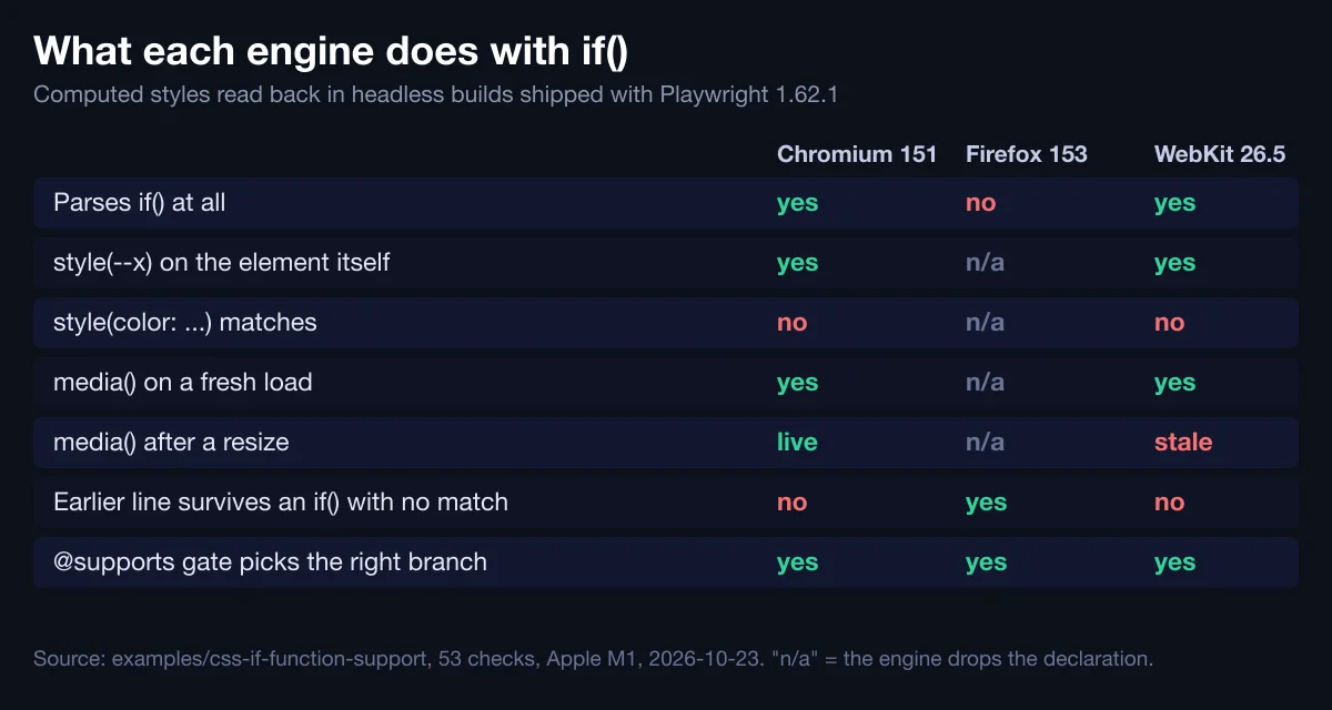
Pair this with a feature check the same way you would for anchor positioning, where an unsupported browser doesn't degrade gracefully, or for subgrid, which got an @supports guard of its own.
When Is if() the Wrong Layer?
When the decision isn't really about style. If size comes from props and drives behavior, markup or an ARIA state, JavaScript owns it, and the CSS should follow a data-* attribute that reflects the same fact. If the question is "how wide is the component's slot", you want container queries, not a viewport test in a value. And if five branches pile up in one declaration, you've written a lookup table inside a property, which reads worse than five small selectors.
I'm also wary of the spec status. A Working Draft that expects breaking changes, two engines without stable support, and a quirk in a third: that's a reason to use it for polish in a project you'll revisit, and a reason to keep it away from the one rule your checkout page needs.
What would change my mind? Firefox shipping it, and Safari's stable notes listing it. I'll rerun the probe when either happens, since the example is built to fail loudly.
Related Reading on CSS Conditions
- CSS :has() patterns for the selector-side alternative to a conditional class
- CSS nesting vs Sass for what native CSS still can't parameterize
- Responsive grids without media queries for layouts that never need a branch