

Run this yourself. The measurement behind the cost section:
css-has-invalidation-cost/in the Coding Dunia code-examples repo. It counts restyled elements for three:has()shapes and prints the numbers for your machine.
Front-end developers spent years writing JavaScript to add a class to a form group when its input was invalid, just so CSS could style the label red. That's a three-line addEventListener for something that should have been a selector. :has() makes it one, and once you start using it, you stop reaching for that JavaScript pattern entirely.
Three terms are worth pinning down before the patterns, because the spec language and the blog-post language diverged years ago:
- Relational pseudo-class is the spec's name for
:has(). It filters the element it's attached to rather than styling what sits in the parentheses. - Parent selector is the informal name the community used for a decade of feature requests. It undersells
:has(), which matches on siblings too. - Anchor element is whatever
:has()is attached to, the thing that actually receives the styles.
Why Was :has() the Most Requested CSS Feature?
CSS selectors worked in exactly one direction for the language's first twenty-five years: an ancestor selects a descendant (.card img), or an earlier element selects a later sibling (.item ~ .item). There was no way to select an element based on what came inside or after it. Want to style a form group differently when its checkbox is checked? You needed JavaScript, because .form-group input:checked selects the input, not the group around it.
:has() flips that. .form-group:has(input:checked) selects the .form-group, using the checkbox state inside it as the condition. It's a relational pseudo-class: it doesn't style what's inside the parentheses, it uses that as a filter for the element it's attached to.
That distinction is the one people trip on first. In .card:has(img), the img is a test, not a target. Nothing about the image gets styled. Read every :has() rule by covering the parentheses and asking what's left, because that leftover is the only thing the declarations touch.
Pattern 1: How Do You Validate Forms Without JavaScript?
Form validation is the pattern that makes the case for :has() all by itself. A single selector styles the whole field wrapper, label included, based on whether the input inside it is invalid, with no event listener and no class toggling anywhere in the JavaScript:
.field {
  border: 1px solid #d1d5db;
  border-radius: 8px;
  padding: 12px;
}

.field:has(input:invalid:not(:placeholder-shown)) {
  border-color: #dc2626;
  background: #fef2f2;
}

.field:has(input:invalid:not(:placeholder-shown)) label {
  color: #dc2626;
}

.field:has(input:valid) {
  border-color: #16a34a;
}
:not(:placeholder-shown) matters here, it stops the invalid style from firing before the user has typed anything. Without it, every empty required field shows red on page load, which is worse UX than no validation styling at all. The input needs a placeholder attribute for this to work, even an empty one, because :placeholder-shown only matches when a placeholder exists to show.
Order matters too. The valid rule is listed last on purpose: both rules can match during typing, and the later declaration wins at equal specificity. Flip them and a field briefly renders green while it is still invalid. That is the whole implementation. Four rules, roughly a dozen lines, replacing an addEventListener on every input plus the class bookkeeping that goes with it.

Pattern 2: How Do Cards React to Their Own Content?
Cards react to their own content through :has(img), which lets one card component handle both the illustrated and the text-only case. Say you have a grid where some cards carry an image and some don't, and each needs different padding:
.card {
  padding: 24px;
}

.card:has(img) {
  padding: 0 0 16px 0; /* image goes edge-to-edge, text keeps padding */
}

.card:has(img) .card-body {
  padding: 16px 24px 0;
}
No JavaScript checking if (card.querySelector('img')) and toggling a class. The CSS itself checks for the image's presence and adjusts layout accordingly.
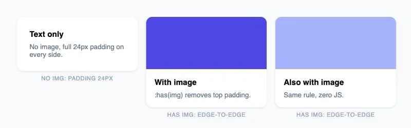
.card component, rendered live: no image gets full padding, the two with images get edge-to-edge treatment automatically, no hasImage prop anywhere in the markup.The real payoff shows up when content is authored elsewhere. A CMS editor adding an image to one card in a list of thirty changes that card's layout with no deploy and no render-time branch in the component. The component stops carrying a hasImage prop entirely, which means one fewer piece of state to thread through and one fewer way for the markup and the styling to disagree. Teams adopting this pattern end up deleting variant="with-image" props wholesale, and each deletion takes a conditional class name with it.
Pattern 3: How Do You Highlight Navigation Based on Siblings?
Sibling matching is the half of :has() people forget. It reads forward from an element as well as down into it, which collapses a familiar navigation effect into a pair of selectors:
/* Dim other nav items when one is hovered, without :hover on each sibling individually */
nav:has(li:hover) li:not(:hover) {
  opacity: 0.5;
  transition: opacity 0.15s ease;
}
The spotlight hover effect above used to require a mouseover listener on the parent plus class bookkeeping across every sibling. Now it's two selectors.
Read the rule right to left and it explains itself: find the nav that contains a hovered li, then dim every li in it that isn't the hovered one. The condition and the target sit in one rule instead of being split between a script and a stylesheet. Keep the transition on the dimmed items rather than on nav, since animating opacity on the container would fade the hovered item along with the rest.
A spotlight hover effect that used to require a JavaScript mouseover listener and class toggling on every sibling is now two CSS selectors.
Pattern 4: How Do You Adapt Layout to Item Count?
:has() combined with :nth-child() or count-based sibling selectors lets a grid change layout based on how many items it holds:
/* If the grid has exactly one child, make it full width */
.grid:has(> .item:only-child) {
  grid-template-columns: 1fr;
}

/* If the grid has more than 4 items, switch to a denser layout */
.grid:has(> .item:nth-child(5)) {
  grid-template-columns: repeat(auto-fill, minmax(180px, 1fr));
}
The :nth-child(5) trick works because :has(> .item:nth-child(5)) matches only if a fifth child exists at all, it's a count check disguised as a position selector.
The child combinator inside the parentheses is doing real work. Without the >, :has(.item:nth-child(5)) would match a fifth .item anywhere in the subtree, including inside a nested grid, and your outer layout would flip based on someone else's markup. Scope it to direct children and the rule stays predictable. For ranges rather than exact counts, :nth-child(n+5) reads as "the fifth or later", which is usually the check you actually wanted.
What Does :has() Cost When the DOM Changes?
Every guide to :has() says the browsers optimized it. Nobody I read says for which selectors, so I measured three shapes of the same idea: style a list item depending on a checkbox. I ran this on 2026-10-16 in headless Chromium 151.0.7922.34 (Playwright 1.62.1, Node 22.23.3) on an Apple M1 with 8 cores. The machine was shared with other jobs and its load average sat between 25 and 54 the whole time, so treat the milliseconds as inflated and read the ratios.
The page is a list of 250 to 4,000 <li class="card"> elements, each with a label and a checkbox. I flip the checkbox of the last card, force style and layout, and count two things. The first is the elementCount that Chromium puts on its UpdateLayoutTree trace event, which is how many elements the style engine recomputed. That's a count, so it doesn't care about load. The second is the median wall time of nine toggles.
The three selectors:
/* self: the subject contains the checkbox */
.card:has(input:checked) { background-color: #fdd; }

/* plus: "the card before the checked one" */
.card:has(+ .card input:checked) { background-color: #fdd; }

/* tilde: "every card before the checked one" */
.card:has(~ .card input:checked) { background-color: #fdd; }
And for each shape, the JavaScript a team would write instead: add a class to exactly the elements that should change, with a plain .card.on rule doing the styling. Elements restyled per click, at every size I tried:
| Selector | 250 cards | 4,000 cards | JS class doing the same job |
|---|---|---|---|
.card:has(input:checked) | 2 | 2 | 1 |
.card:has(+ .card input:checked) | 251 | 4,001 | 1 |
.card:has(~ .card input:checked) | 251 | 4,001 | 3,999 (a loop over all earlier cards) |
The first row is the good news. When the thing you test sits inside the thing you style, the browser touches the card and the checkbox and stops, whether the list has 250 items or 4,000. It cost 0.004 ms per click, which is what the class costs too.
The second row surprised me. :has(+ ...) only ever matches one card, the one directly before the checked card, yet Chromium restyled every card in front of it. I checked the position: toggling the first card of a 4,000-card list restyled 1 element, the middle one 2,002, the last one 4,001. My reading, which I didn't confirm in the engine source, is that Chromium can't cheaply tell which earlier sibling is the one, so it recomputes all of them and keeps the results that didn't change. Time stayed linear, though: 5.4 ms for 4,000 cards, the same as the JavaScript loop that restyles a similar number of elements.
The third row is where the cost stops being a count. Same number of restyled elements as the second row, completely different bill:
| Cards | :has(+ ...) | :has(~ ...) | JS class loop over all earlier cards |
|---|---|---|---|
| 250 | 0.3 ms | 0.5 ms | 0.3 ms |
| 500 | 0.6 ms | 1.3 ms | 0.6 ms |
| 1,000 | 1.1 ms | 6.3 ms | 1.2 ms |
| 2,000 | 2.5 ms | 26.3 ms | 2.5 ms |
| 4,000 | 5.4 ms | 100.9 ms | 5.4 ms |
Median milliseconds per click, run 1. A second, independent run gave 82.6 ms for :has(~ ...) at 4,000 cards and 5.1 and 4.9 ms for the other two. A third run, before I added the position check, gave 96.1 ms. The direction never moved.
Look at the last two columns. The JavaScript loop restyles the same 3,999 elements and finishes in 5.4 ms. The selector takes 100.9. Both restyle the same elements, so the gap isn't restyling, it's matching. My guess is that each earlier card makes the engine look through every card after it for a checked box. Quadruple the list and the selector gets 12 to 16 times slower, which is what quadratic looks like. The class loop got 4.5 times slower for the same quadrupling.
A :has() selector that looks at later siblings costs time proportional to the square of the list length. In Chromium 151, :has(~ .card input:checked) took 100.9 ms per click at 4,000 cards; the equivalent JavaScript class loop took 5.4 ms.
Does any of this matter for the patterns earlier in this article? Almost never. A star rating has five siblings, a nav has seven, a form group has one input. At 250 siblings the worst selector still finished in half a millisecond. By my numbers :has(~ ...) crosses a 16.7 ms frame somewhere between 1,000 and 2,000 siblings, so it only bites on long lists, wide tables and feeds, which is exactly where "highlight everything before the selected row" tends to get written.
Three limits on what I measured. It's one engine: I didn't run Firefox or Safari, and they may invalidate differently. It's one DOM shape, a flat list with one level of children, and a deeper tree changes how much each recomputed element costs. And my first version of the script used opacity as the changed property, which made the class loop quadratic too. My explanation, unconfirmed, is that every element below 1.0 opacity gets its own paint layer and creating thousands of layers is slow all by itself. I switched to background-color and the class loop went linear. If you replicate this, pick a property that doesn't create layers or you'll blame the selector for the compositor's work.
What I'd do with it: anchor :has() on the ancestor of the thing you test (rows one and two are fine at any size I tried), treat :has(~ ...) as a small-list tool, and past a thousand siblings do what the table says and put a class on the elements that change.
How Does :has() Compare to the Old Way?
| Task | Before :has() | With :has() |
|---|---|---|
| Style a label when its input is invalid | JS event listener + class toggle | .field:has(input:invalid) |
| Card layout depends on content | JS querySelector check on render | .card:has(img) |
| Dim siblings on hover | JS mouseover on parent, class per sibling | nav:has(li:hover) li:not(:hover) |
| Detect empty state in a list | JS check .length === 0 | ul:not(:has(li)) |
That last row is the one worth memorizing. ul:not(:has(li)) selects a <ul> with zero list items, which means an empty-state message can live entirely in CSS: put it in a sibling element and reveal it when the list matches.
Empty states are worth singling out because they are where the JavaScript version rots fastest. The check runs on render, then something updates the list without re-running it, and the "No results" text sits under a populated list until the next full render. A selector has no such failure mode; it re-evaluates whenever the DOM changes, which is exactly the guarantee you wanted from the script and never quite got.
Where Does :has() Still Need a JavaScript Fallback?
:has() can't react to things that aren't in the DOM or reflected as an attribute, scroll position, viewport size beyond media queries, or arbitrary JavaScript state that isn't exposed as a class or data-* attribute. If your condition is "user has scrolled past 500px," that's still an IntersectionObserver, not a selector. And for the very rare enterprise environment still running a pre-2023 browser, wrap the rule:
@supports selector(:has(a)) {
  .field:has(input:invalid) { border-color: #dc2626; }
}
That keeps the styling from silently failing where :has() isn't parsed at all, since an unsupported selector is simply ignored rather than causing an error.
Deciding whether a given effect needs the fallback comes down to three questions, in order:
- Does the condition already exist in the DOM, as an element, an attribute, or a pseudo-class state? If not,
:has()cannot see it and you need script regardless of browser support. - Is the styling decorative or load-bearing? A dimmed sibling degrading to no dimming is fine. A hidden empty-state message that never appears is a bug.
- Do your analytics actually show pre-2023 browsers? For most public sites in 2026 the answer is a rounding error, and the
@supportswrapper is cheap insurance rather than a requirement.
Check your own codebase for one thing before you close this tab: a component prop or a useState that exists purely to mirror something already present in the DOM, an image, a count, a validation state. That's usually a :has() selector wearing a disguise.
Which Guides Pair Well With This One?
- CSS anchor positioning - tooltips and popovers that place themselves, covering the positioning work
:has()can't do - CSS Grid vs Flexbox
- CSS container queries
- CSS centering guide