

Run this yourself. The measurement behind the breakpoint and scrollbar tables:
css-auto-fit-breakpoints/in the Coding Dunia code-examples repo. It asks Chromium for the resolved tracks at every container width and asserts the result.
You get a responsive CSS grid without media queries by describing the tracks you want instead of the exact number of columns. Write grid-template-columns: repeat(auto-fit, minmax(280px, 1fr)), add a gap, and the browser packs in as many columns as fit at 280px each, then reflows to fewer columns, and finally to one, as the container narrows. The breakpoints happen automatically because the sizing is intrinsic. Card grids built this way go from four columns on a wide dashboard to a single column on a 360px phone without a single @media block. That's the whole trick. Everything below is why it works and where it bites.
How does repeat(auto-fit, minmax(280px, 1fr)) work?
This one-line value packs three separate mechanisms into a single declaration, and it reads like a spell until you see what each token does on its own. Intrinsic sizing is CSS letting an element compute its own size from content and available space rather than the developer hard-coding it, and that's exactly what auto-fit does for the column count here. Take it apart piece by piece below.
.grid {
  display: grid;
  grid-template-columns: repeat(auto-fit, minmax(280px, 1fr));
  gap: 1.5rem;
}
repeat() is a shorthand so you don't type the same track size over and over. Normally you'd pass a fixed count, like repeat(3, 1fr) for three equal columns. Here the count is a keyword instead. auto-fit tells the browser to compute the count itself based on how many tracks fit the container. Each generated track is sized by minmax(280px, 1fr), which means "never smaller than 280px, but grow to an equal share of leftover space." So the browser divides the available inline width by 280px plus the gap, floors that to a whole number, and lays out exactly that many columns. Widen the container and one more column pops in. Shrink it and a column drops off. The reflow is continuous and free.
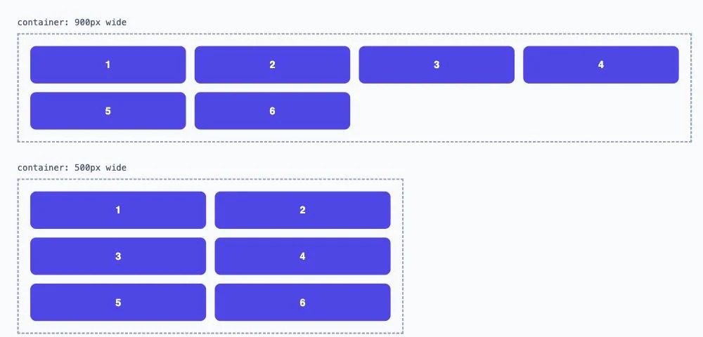
repeat(auto-fit, minmax(200px, 1fr)) rule rendering inside a 900px and a 500px box side by side, rendered live to confirm the reflow actually happens with zero @media rules.
auto-fit vs auto-fill: what's the real difference?
This is the part people get wrong, and I did too for an embarrassingly long time. Both keywords create as many tracks as fit. The difference only appears when the row has extra space that no item fills.
/* Items stretch to fill the row */
.grid-fit  { grid-template-columns: repeat(auto-fit,  minmax(280px, 1fr)); }

/* Empty phantom tracks stay, items keep their min size */
.grid-fill { grid-template-columns: repeat(auto-fill, minmax(280px, 1fr)); }
Say your container is 1200px wide and you have two cards. With auto-fill, the grid still reserves the extra column tracks it could fit, leaves them empty at 280px each, and your two cards sit at the left looking lonely. With auto-fit, those empty tracks collapse to zero width, and the 1fr maximum lets your two real cards stretch to share the full 1200px. Per MDN, that collapse is the entire distinction. Which one do you want? Almost always auto-fit, because stretched cards look intentional and empty phantom columns look like a bug. Use auto-fill when you specifically want items to keep a fixed size and not balloon, like a photo grid where thumbnails shouldn't grow past their natural width.
When Should You Reach for auto-fit Instead of auto-fill?
Pick auto-fit for nearly every card grid, gallery, or dashboard layout, because stretched cards read as intentional design while empty phantom columns read as a layout bug. Reach for auto-fill only when items must keep a fixed size no matter how much extra row space exists, a thumbnail strip or a fixed-width tag list where growing past the natural size would look wrong. According to MDN, both keywords generate the same number of tracks given identical container width and minmax values, so switching between them changes zero layout math, only what happens to the leftover space.
Choose auto-fit for nearly every card grid because stretched items look intentional, and reserve auto-fill for the rare case where items must hold a fixed size regardless of leftover row space, such as a thumbnail strip that should never balloon past its natural width.
| auto-fit | auto-fill | |
|---|---|---|
| Empty tracks | Collapse to zero width | Stay reserved at their minmax floor |
| Items with extra row space | Stretch to fill via the 1fr maximum | Stay close to the minimum (282px in a 1200px container), because the empty tracks share the leftover |
| Visual result on a wide container with few items | Cards stretch, looks intentional | Cards stay small, empty phantom columns |
| Best for | Card grids, most layouts | Fixed-size thumbnails that shouldn't balloon |
What does minmax() actually control?
minmax(min, max) defines a size range for a track, and it's the load-bearing part of this pattern. The minimum sets the point where a column is allowed to drop to the next row. The maximum, usually 1fr, lets the surviving columns divide the space evenly.
.cards {
  display: grid;
  grid-template-columns: repeat(auto-fit, minmax(min(320px, 100%), 1fr));
  gap: 1rem;
}
Notice min(320px, 100%) as the minimum. That's a small guard I add on almost every grid now. A bare minmax(320px, 1fr) can overflow when the container is narrower than 320px, because the track refuses to shrink past its floor. Wrapping the floor in min(320px, 100%) says "320px, unless that's wider than the container, in which case just use 100%." One item on a 300px screen then fits cleanly instead of forcing a horizontal scrollbar. It's four extra characters that kill a whole class of mobile overflow bugs.
Where does clamp() fit in?
clamp(min, preferred, max) gives you a fluid value that scales with the viewport but stays inside bounds. It pairs beautifully with intrinsic grids for the gap, the track floor, or padding, so those scale too instead of jumping.
.grid {
  display: grid;
  grid-template-columns: repeat(auto-fit, minmax(clamp(240px, 30vw, 340px), 1fr));
  gap: clamp(1rem, 2.5vw, 2rem);
}
Here the track minimum grows from 240px on a phone toward 340px on a big monitor, tracking 30vw in between. The gap breathes the same way, from 1rem up to 2rem. No breakpoints touch any of it. Is this overkill for a simple three-card row? Probably. But on content-heavy dashboards, fluid gaps and floors remove that stair-step feeling you get from hard breakpoints, and users never notice the layout "snapping."
How do gap and the grid work together?
gap sets the space between tracks, and the auto-fit math already accounts for it, which surprises people. The browser fits columns using track width plus gap, so you don't subtract anything by hand.
.grid {
  display: grid;
  grid-template-columns: repeat(auto-fit, minmax(280px, 1fr));
  gap: 24px 16px; /* row-gap 24px, column-gap 16px */
}
You can pass one value for both axes or two for row and column separately. The old margin hacks, negative margins on the container to cancel edge gaps, are gone. gap only applies between items, never on the outer edges, so your grid sits flush with its container. If you've ever fought :last-child margin rules to kill a trailing gutter, you'll appreciate how little there is to think about here. Moving a grid like this into a component's style prop means camelCase keys and quoted values, and the CSS to React style converter writes that object from a pasted rule.

Where Exactly Does the Grid Switch Column Count?
"No breakpoints" is a slight exaggeration. The grid has breakpoints, you just don't write them. They fall wherever the arithmetic says, and I wanted the actual numbers rather than my own back-of-envelope version. So I asked headless Chromium (151.0.7922.34, Playwright 1.62.1, Node 22.23.3, Apple M1, 2026-10-16) to lay out a repeat(auto-fit, minmax(280px, 1fr)) grid of twelve items at every container width from 200px to 1600px, one pixel at a time, and report the resolved track list each time. Nothing here is timed, so it doesn't matter that the machine was busy, and repeated runs printed identical results.
The rule it confirmed, to the pixel, for every gap I tried: n columns first fit at n * minimum + (n - 1) * gap.
| Gap | 2 columns | 3 columns | 4 columns | 5 columns |
|---|---|---|---|---|
| 0px | 560px | 840px | 1120px | 1400px |
| 16px | 576px | 872px | 1168px | 1464px |
| 24px | 584px | 888px | 1192px | 1496px |
| 32px | 592px | 904px | 1216px | 1528px |
If you assumed 560, 840 and 1120 from the 280px floor, your breakpoints are off by the gap, and the error grows with every column. That's 72px at four columns with a 24px gap. It's the reason a container 860px wide, which "should" have three columns by that arithmetic, shows two.
The second thing the sweep showed is how violent the changes are. The card width isn't smooth, it's a sawtooth. With a 24px gap:
| Container width | Columns | Width of one card |
|---|---|---|
| 583px | 1 | 583px |
| 584px | 2 | 280px |
| 887px | 2 | 431.5px |
| 888px | 3 | 280px |
| 1191px | 3 | 381px |
| 1192px | 4 | 280px |
One pixel of container width took a card from 583px to 280px. A card is never narrower than the minimum, but in a single-column grid it can be 2.08 times wider than it, and your card's internal layout, image ratio and line lengths have to survive that whole range. The 1fr maximum isn't a polish detail. It decides how wide the card is for most of the range.
Now the real-page version, because container width isn't viewport width. I put the same grid in a page with 24px of horizontal padding on each side and swept the viewport (an iframe, whose width is its viewport) from 300px to 1700px, twice: once with the overlay scrollbars headless Chromium uses by default, and once with a 15px classic scrollbar. Headless can't draw a native classic scrollbar, so I stood one in with ::-webkit-scrollbar { width: 15px }, which reserves the same 15px.
| Columns | Container breakpoint | Viewport, overlay scrollbar | Viewport, 15px classic scrollbar |
|---|---|---|---|
| 2 | 584px | 632px | 647px |
| 3 | 888px | 936px | 951px |
| 4 | 1192px | 1240px | 1255px |
| 5 | 1496px | 1544px | 1559px |
The overlay column is the container breakpoint plus 48px of padding, exactly. The classic column is 15px later again, exactly. So a visitor on a 1250px window with a Windows-style scrollbar sees three columns while a visitor on 1250px with a trackpad sees four, and the same is true for every 15px slice above each breakpoint. If you screenshot your layout on a laptop and ship it, some of your visitors are looking at a different grid than the one you checked.
The column count of an auto-fit grid changes at n times the minimum plus (n minus 1) gaps. With a 280px minimum and 24px gap that is 584, 888 and 1192px of container width, and a 15px classic scrollbar pushes each viewport breakpoint 15px later.
And the cases the intro section waves at, measured in a 1200px container with the 24px gap:
| Items | auto-fit, one card | auto-fill, one card |
|---|---|---|
| 1 | 1200px | 282px |
| 2 | 588px | 282px |
| 3 | 384px | 282px |
| 5 | 282px | 282px |
Both modes created the same number of tracks, four, and both reported them in the resolved grid-template-columns. The difference is that auto-fit kept the empty ones at 0px. The 282px under auto-fill isn't the 280px floor either: the empty tracks take their share of the 1fr leftover, so the cards creep above the minimum. At 600px, 900px and 1200px the lone card measured 288, 284 and 282px.
Finally, the overflow case. In a 240px container the bare minmax(280px, 1fr) produced a 280px track, which overflowed by 40px. At 200px the overflow was 80px. With minmax(min(280px, 100%), 1fr) both measured zero. At 280px and above there was no difference at all, so the guard costs nothing where it isn't needed.
Limits. One engine, so Firefox and Safari could round fractional tracks differently, though the breakpoint formula is straight from the spec's track sizing. A classic scrollbar is emulated, not native. And I only varied one minimum (280px), though the formula held for every gap.
Where does this pattern break?
Three failure modes come up often with this pattern, and it's not magic, pretending otherwise will burn you eventually. Knowing which one you're hitting takes about ten seconds if you check in this order:
- Check the container width against your
minmaxfloor. If the container is narrower than the floor, that's overflow, fix it withmin(floor, 100%). - Count the items in the row. If there's exactly one card and it stretches oddly wide, that's the single-item stretch problem, cap it with
max-widthor switch toauto-fill. - Check whether the layout issue is inside a single card rather than the column count. If a card itself needs to restructure, that's outside what
auto-fitcan ever solve, reach for a container query instead.
First, very narrow containers. If your minmax floor is 280px and the grid lives inside a 240px sidebar, the track can't shrink and content overflows. The min(280px, 100%) trick fixes it, but you have to remember to apply it. Second, single-item rows. With one card and auto-fit, that card stretches to the full width, which can look absurd at 1400px. Cap it with a max-width on the item or switch to auto-fill so it keeps a sane size. Third, and this is the real ceiling: auto-fit only changes how many columns exist. It can't restyle the inside of a card. When a card needs to go from a stacked layout to an image-beside-text layout based on its own width, no amount of grid track math helps. That's exactly when a container query beats it, because the query reacts to the item's available space, not the column count. For the broader tradeoff between one-dimensional and two-dimensional layout, see the pillar on CSS Grid vs Flexbox.
auto-fit only changes how many columns exist in a grid; it can't restyle the inside of a card. A is a CSS rule that styles an element based on its own available space rather than the viewport, and that's exactly when it beats auto-fit for component-level responsiveness.
What Else Should You Read?
- CSS Container Queries - reach for these when the viewport-based, track-count approach isn't enough and a component needs to restyle based on its own width.