
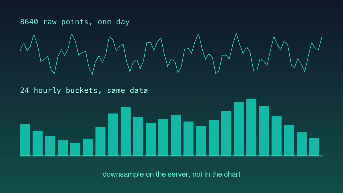
Every charting tutorial uses a clean dataset of twelve monthly values. Real time-series data is nothing like that: irregular intervals, gaps where the device dropped off, a counter that resets at 3am for no reason you can find, and far more points than pixels. Home Assistant produces all four, which makes it an unusually good place to learn the parts that tutorials skip.
The History Endpoint
One GET, one token, one entity:
const start = new Date(Date.now() - 24 * 60 * 60 * 1000).toISOString();
const params = new URLSearchParams({
  filter_entity_id: "sensor.house_power",
  end_time: new Date().toISOString(),
  minimal_response: "true",
  no_attributes: "true",
});

const res = await fetch(`${BASE}/api/history/period/${start}?${params}`, {
  headers: { Authorization: `Bearer ${TOKEN}` },
});
const [series]: RawState[][] = await res.json();
The nesting catches everyone once: the response is an array of arrays, one per entity, even when you asked for a single entity. And every state is a string, as covered in our guide to typing Home Assistant data in TypeScript, so parsing happens here rather than in the chart component.
minimal_response and no_attributes together cut a day of one power sensor from several megabytes to a few hundred kilobytes. On a wall panel over Wi-Fi that difference is the gap between a chart that appears and one that hangs.
Bucketing, and Why the Sensor Type Decides the Method
Aggregation is where the domain knowledge lives. Two sensors, two completely different correct answers.
A temperature sensor is a measurement. Its value at any moment stands alone, so an hourly bucket is the mean of the values inside it, and min and max are worth keeping alongside.
An energy sensor is usually total_increasing, a lifetime counter in kWh that only rises. Averaging it produces a number with no physical meaning. What you want per bucket is the last value minus the first, the consumption during that window.
interface Bucket { t: number; value: number; min?: number; max?: number }

function bucketMeasurement(points: Point[], ms: number): Bucket[] {
  const groups = new Map<number, number[]>();
  for (const p of points) {
    const key = Math.floor(p.t / ms) * ms;
    const list = groups.get(key);
    if (list) {
      list.push(p.value);
    } else {
      groups.set(key, [p.value]);
    }
  }
  return [...groups.entries()]
    .map(([t, vals]) => ({
      t,
      value: vals.reduce((a, b) => a + b, 0) / vals.length,
      min: Math.min(...vals),
      max: Math.max(...vals),
    }))
    .sort((a, b) => a.t - b.t);
}

function bucketCounter(points: Point[], ms: number): Bucket[] {
  const groups = new Map<number, number[]>();
  for (const p of points) {
    const key = Math.floor(p.t / ms) * ms;
    const list = groups.get(key);
    if (list) {
      list.push(p.value);
    } else {
      groups.set(key, [p.value]);
    }
  }
  return [...groups.entries()]
    .map(([t, vals]) => {
      let total = 0;
      for (let i = 1; i < vals.length; i++) {
        const delta = vals[i] - vals[i - 1];
        total += delta < 0 ? vals[i] : delta;
      }
      return { t, value: total };
    })
    .sort((a, b) => a.t - b.t);
}
That delta < 0 branch is the counter-reset handling, and it is not theoretical. A device reboots, the counter goes back to zero, and without that line the chart shows a large negative bar for the hour it happened. Treating the post-reset value as the contribution is the standard convention and it is close enough to correct.
Downsampling Without Deleting the Spikes
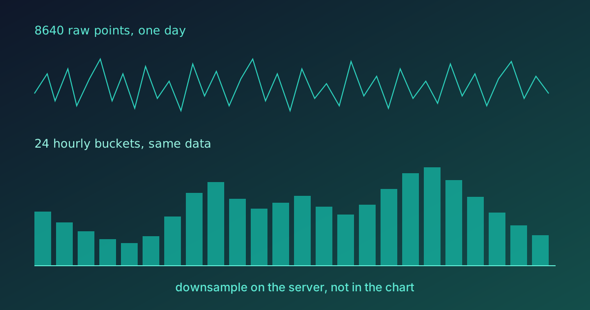
Once bucketed you may still have more points than pixels, and the obvious fix, keeping every Nth point, is the wrong one. Sampling drops whichever points it doesn't land on, and the interesting ones, the 3kW spike when the kettle and the oven overlapped, are exactly the ones most likely to disappear.
Min-max decimation keeps them. Divide the series into as many windows as you have target points, and emit both the minimum and the maximum from each window in their original time order:
function decimate(points: Bucket[], target: number): Bucket[] {
  if (points.length <= target) {
    return points;
  }
  const windowSize = Math.ceil(points.length / (target / 2));
  const out: Bucket[] = [];
  for (let i = 0; i < points.length; i += windowSize) {
    const slice = points.slice(i, i + windowSize);
    let lo = slice[0];
    let hi = slice[0];
    for (const p of slice) {
      if (p.value < lo.value) {
        lo = p;
      }
      if (p.value > hi.value) {
        hi = p;
      }
    }
    if (lo.t <= hi.t) {
      out.push(lo, hi);
    } else {
      out.push(hi, lo);
    }
  }
  return out;
}
The output is visually indistinguishable from the full series at chart resolution, which is the whole point, and it is a fraction of the DOM nodes.
Recharts Config That Survives Real Data
Two settings matter more than the rest.
connectNulls={false} on the line. Home Assistant sensors go unavailable, and a chart that bridges a four-hour gap with a straight line is showing data that never existed. Let the gap be visible.
Explicit domain on the Y axis for anything with a meaningful floor. Power draw starts at zero, and Recharts' automatic domain will happily start an axis at 1,800W, which turns a 5% variation into a chart that looks like a cliff.
<ResponsiveContainer width="100%" height={280}>
  <LineChart data={decimated}>
    <XAxis
      dataKey="t"
      type="number"
      scale="time"
      domain={["dataMin", "dataMax"]}
      tickFormatter={(t) => new Date(t).toLocaleTimeString([], { hour: "2-digit" })}
    />
    <YAxis domain={[0, "auto"]} unit=" W" width={70} />
    <Tooltip labelFormatter={(t) => new Date(Number(t)).toLocaleString()} />
    <Line type="monotone" dataKey="value" dot={false} connectNulls={false} strokeWidth={2} />
  </LineChart>
</ResponsiveContainer>
dot={false} is not cosmetic either. At 600 points, individual dots are both unreadable and a meaningful share of the render cost.
Why Aggregation Is the Hard Part
It is worth being explicit about why this article spends most of its length on data preparation rather than on chart configuration, because the balance surprises people coming from tutorials where the chart is the whole exercise.
A chart library takes an array and draws it. That part is genuinely solved, and any of the mainstream options will produce something reasonable from clean input. What none of them can do is decide what a point in your series means, and that decision is domain knowledge that has to happen before the data reaches the component. Averaging a counter, sampling away a spike, or bridging a four-hour outage with a straight line are all mistakes the renderer will execute faithfully and without complaint, and every one of them produces a chart that looks completely convincing while being wrong.
That is the failure mode worth guarding against. A chart that crashes gets fixed the same afternoon. A chart that quietly understates your peak load because the decimation dropped it gets believed for months, and it informs decisions, and nobody goes back to check the aggregation because the picture looked plausible from the start.
A chart that crashes gets fixed the same afternoon; a chart that quietly understates your peak load gets believed for months.
So the useful habit is to treat the transformation from raw states to chart-ready buckets as its own module with its own tests, well away from any React component. Feed it a fixture containing a counter reset, a gap, and a burst of duplicated timestamps, all of which a real Home Assistant instance produces sooner or later, and assert on the numbers rather than eyeballing the output. Here's the case that convinced me. I ran bucketCounter from above on a six-point fixture where the counter falls from 1200.9 to 0.1 halfway through the hour. Without the delta < 0 line the bucket comes out at -1199 kWh; with it, about 1.9. On screen the first result is one odd bar you might blame on the sensor. As an assertion it fails in a single line, and I'd take the assertion every time.
There is a second reason to keep the two layers apart. Charting libraries go out of fashion faster than data does. The bucketing and decimation logic here is plain TypeScript over plain arrays, so moving from Recharts to something canvas-based later is an afternoon of component work rather than a rewrite. Coupling the aggregation to the renderer is what turns that afternoon into a fortnight.
What This Costs in Practice
Measured on a day of one power sensor at 10-second resolution, 8,640 raw points, rendered in Chrome on a 2021 laptop:
| Approach | Points rendered | Initial render |
|---|---|---|
| Raw series | 8,640 | 1,420 ms |
| Hourly buckets only | 24 | 12 ms |
| 15-min buckets plus decimation to 600 | 600 | 38 ms |
The middle row is fast and hides everything interesting inside each hour. The last row is the one worth shipping, and 38ms is comfortably inside a frame budget even on tablet hardware.
Aggregation is the whole job here. The chart library is almost incidental, which is the opposite of how most charting tutorials are framed, and it is why the same code moves to a different library in an afternoon. Get the buckets right and any renderer will look good.