

Image optimization is two independent jobs wearing one name: shrinking the bytes that travel, and reserving the layout space before those bytes arrive. A 40KB AVIF image that loads without dimensions still causes a layout shift exactly like a 400KB JPEG would. Format conversion alone fixes the network tab and does nothing for the CLS score, because that's a completely different problem with a completely different fix. The demo further down shows both effects side by side, and I'd argue that split is the most useful thing to internalize about image work.
Two words get used interchangeably in image-performance threads and mean completely different things:
- Format optimization is re-encoding the same picture into AVIF or WebP so fewer bytes travel. It changes load time and nothing else.
- Layout stability is telling the browser how much space to reserve before the bytes arrive. It changes CLS and nothing else.
- LCP element is whichever above-the-fold element paints largest, which on an article page is almost always the hero image.
Work through a page in this order, because each step makes the next one measurable:
- Add explicit
widthandheightto every image. This is the CLS fix and it needs no build tooling. - Identify the LCP element and give it
loading="eager"plusfetchpriority="high". - Convert formats to AVIF with a WebP fallback, which is where the byte savings live.
- Re-measure. If CLS moved when you changed formats, something else on the page is shifting.

Step 1: How does astro:assets generate AVIF and WebP?
The astro:assets module handles AVIF and WebP generation plus responsive sizing on its own, calling Sharp under the hood, so a project gets a full image pipeline without adding a build tool or a CDN. One component call replaces what used to be a Gulp task:
---
import { Image } from 'astro:assets';
import heroImage from '../assets/hero.jpg';
---

<Image
  src={heroImage}
  alt="Team working on a laptop with code on screen"
  widths={[400, 800, 1200]}
  sizes="(max-width: 768px) 100vw, 1200px"
  format="avif"
  fallbackFormat="webp"
  loading="eager"
  fetchpriority="high"
/>
That call generates AVIF at three widths, a WebP fallback for browsers without AVIF support, and a srcset/sizes pair so the browser picks the right file for its viewport instead of always downloading the largest. fallbackFormat="webp" is the detail that's easy to skip and shouldn't be: it keeps the image correct in the shrinking set of browsers without AVIF, rather than falling back to the original unoptimized JPEG.
The widths array deserves a moment of thought rather than a copy-paste. Each entry is a separate Sharp encode at build time, so nine widths on two hundred images is a meaningfully slower build for resolution steps no device will ever request. Three widths spanning your real breakpoints covers almost every layout.
sizes is the half people get wrong. It describes how wide the image renders at each breakpoint, not how wide the file is, and the browser uses it to choose from srcset before layout happens. Get it wrong and it will happily download the 1200px file for a 400px slot.
Step 2: What do you do in React components outside the Astro pipeline?
If you're rendering images from a React island (an interactive component hydrated client-side) rather than Astro's own templating, you don't get <Image> for free, but the same principles apply manually:
interface ResponsiveImageProps {
  src: string;
  avifSrc: string;
  alt: string;
  width: number;
  height: number;
  priority?: boolean;
}

function ResponsiveImage({ src, avifSrc, alt, width, height, priority = false }: ResponsiveImageProps) {
  return (
    <picture>
      <source srcSet={avifSrc} type="image/avif" />
      <img
        src={src}
        alt={alt}
        width={width}
        height={height}
        loading={priority ? 'eager' : 'lazy'}
        fetchPriority={priority ? 'high' : 'auto'}
        decoding={priority ? 'sync' : 'async'}
      />
    </picture>
  );
}
The explicit width and height attributes here aren't decorative, they're what lets the browser compute the image's aspect ratio and reserve that exact space in the layout before a single byte of image data arrives, which is the actual fix for CLS. A <picture> with an AVIF <source> and a plain <img> fallback covers format selection without a build-time pipeline at all, at the cost of doing the resizing yourself ahead of time. Two Sharp calls in a script and the output committed to public/ is usually enough for a handful of island images.
The explicit width and height attributes aren't decorative - they're what lets the browser reserve the layout space before a single byte of image data arrives.
Step 3: Which CSS preserves the aspect ratio at any size?
img {
  max-width: 100%;
  height: auto;
  aspect-ratio: attr(width) / attr(height);
}
Three declarations on the img element cover every responsive case, and the aspect-ratio line is the one doing the real work. It derives the ratio from the HTML width and height attributes directly, supported across evergreen browsers since 2023, so the reserved space matches whatever size the image actually renders at rather than its literal pixel dimensions.
Without it, a responsive image scaled by width: 100% can still shift, because the browser reserved space from the raw attribute values and the computed height disagrees once CSS gets involved.
height: auto is what makes that safe. Set an explicit CSS height alongside a width: 100% and you override the aspect ratio the attributes established, which reintroduces exactly the layout shift the attributes were there to prevent.
How Do You Measure the Before and After?
Measure with Lighthouse for the lab numbers and the web-vitals package for what real visitors see, because the two disagree more often than people expect. The numbers below come from a demo you can run yourself, one mock article page rendered twice, measured with PerformanceObserver in the browser. One run each, local and unthrottled:
| Metric | Naive (full-size JPEG, no dimensions, lazy) | Pipeline (AVIF srcset + explicit dimensions) |
|---|---|---|
| CLS | 0.103 (over the 0.1 line) | 0.000 |
| Transferred image bytes | 100 kB | 6 kB |
| LCP | 272 ms | 252 ms |
LCP barely moves, and that is the honest reading of a local run: with no network throttling, bytes are nearly free. On a slow connection I'd expect the 94 kB gap to show up in LCP, but I haven't measured that here, so read it as a prediction and not a result. The demo also ships both fixes at once, so the table can't split them. The CLS half follows from how the metric works, since the browser can only reserve space it has dimensions for. The bytes half is the AVIF encode.
You don't have to take that table on trust. The same comparison is two live components you can run: the same mock article rendered twice, once with a naive full-size JPEG carrying no dimensions and loading="lazy", once with the output shape astro:assets emits. CLS, transferred bytes and LCP are read out of PerformanceObserver in your own browser, and every run cache-busts the images so a cached file cannot quietly report zero bytes.
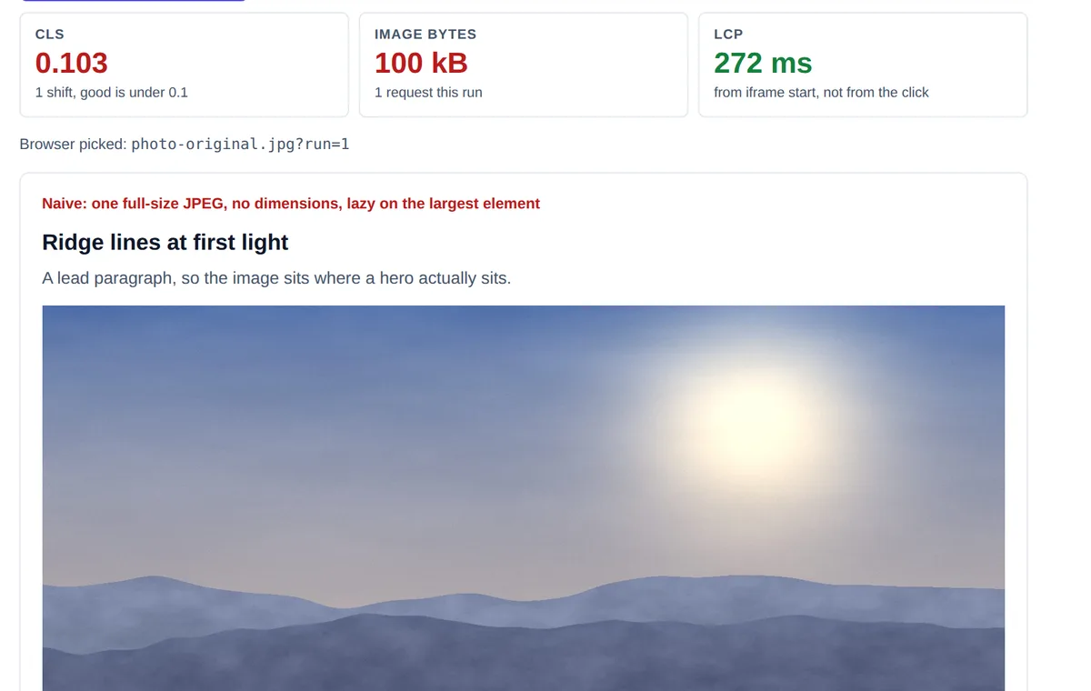
width or height, loading="lazy" on the largest element. CLS 0.103, 100 kB transferred.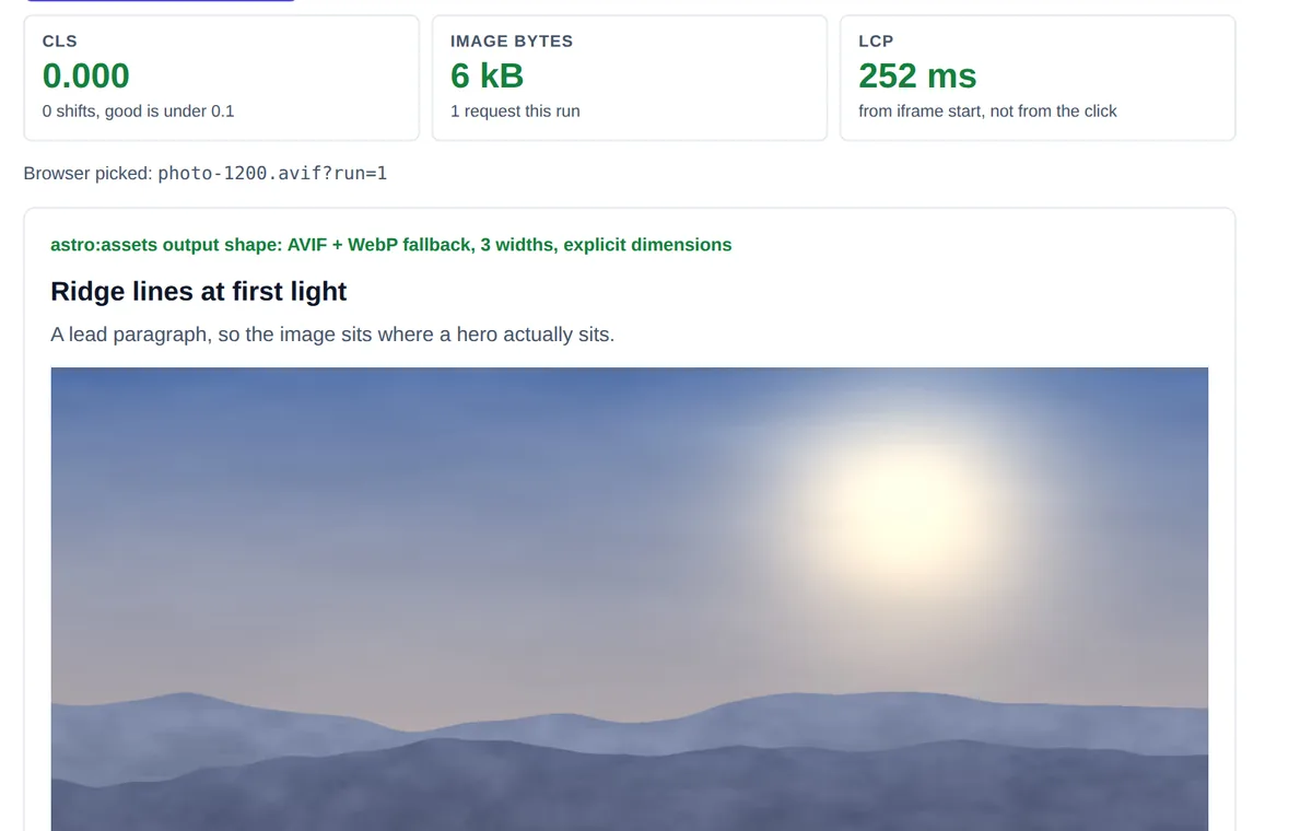
Two details in those readouts are worth more than the headline numbers. The optimized panel names the file the browser actually chose out of srcset, which is the only honest way to check your sizes attribute, since the browser resolves it before layout and never tells you in the markup. And the naive panel scores a harmless CLS if you put the image at the bottom of the frame with one line of text under it. CLS is impact fraction times distance fraction, so the same broken markup can measure close to zero in a cramped demo and 0.10 or worse on a real article page. If your CLS looks fine, check whether you measured somewhere the shift had nothing left to push.
Splitting the two changes across separate commits is worth the extra minute. Ship them together and you learn that the page got faster without learning which half did it, which matters the next time someone proposes dropping the attributes to simplify a component.
Why Should You Never Lazy-Load the Hero Image?
<!-- Wrong: this is almost certainly your LCP element -->
<img src="/hero.avif" alt="..." loading="lazy" />

<!-- Right: eager + high priority for the largest above-the-fold element -->
<img src="/hero.avif" alt="..." loading="eager" fetchpriority="high" />
Lazy-loading the hero image delays the request for the element most likely to be your LCP candidate, which is the opposite of what you want. loading="lazy" tells the browser to defer until the image is near the viewport, and the hero is already in the viewport on page load, so the attribute buys nothing and costs you the metric.
Reserve lazy for images below the fold, where deferring genuinely saves bandwidth on a page the user might never scroll.
The failure is easy to introduce and hard to spot, because a blanket loading="lazy" on every img looks like a tidy optimization in review and passes every functional test.
How Do You Audit an Existing Site for This Gap?
Audit an inherited codebase by running Lighthouse against three or four representative pages and reading two audits separately: "Serve images in next-gen formats" for file size, and "Avoid large layout shifts" for CLS. A pass on one and a fail on the other is the exact signal that a previous optimization pass converted formats without touching dimensions, or the reverse, someone added width/height attributes to stop a CLS warning without ever revisiting the source format. Both audits need to pass on the same page before you can call the pipeline complete; a green score on one implies nothing about the other.
Lighthouse only tells you about the pages you point it at, so pair it with a repository-wide check. Grep for <img without a neighbouring width=, and for loading="lazy" appearing anywhere in a hero or banner component. On a codebase of any age those two searches find more real problems in five minutes than a week of per-page auditing.

My bet, and it is only a bet, is that on most inherited Astro or React sites format conversion has been done at least partially while dimensions were skipped entirely. Run those two searches on yours before you believe me.
What Is the Takeaway?
Format optimization and layout stability are separate fixes with separate causes, and a pipeline that only handles one leaves real Core Web Vitals points on the table. astro:assets (or a manual <picture> pattern for React islands) handles AVIF generation and responsive sizing; explicit width/height handles CLS. Both are needed, and neither substitutes for the other.